Ambient Orchestration, Ubiquitous User Interfaces & The Humane AIPin
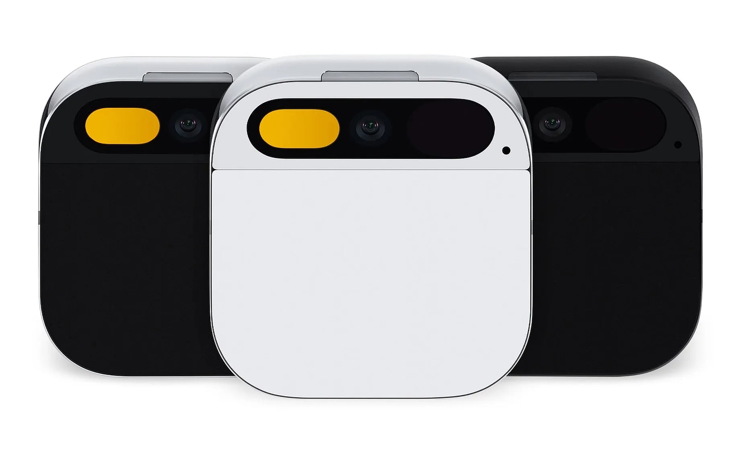
The AIPin is not here to kill anything, especially not the screen, but rather become a building bloc in a ubiquitous user interface.
Ubiquitous UIs
Ubiquitous user interfaces, are user interfaces (UIs) which are multi-modal and can be interacted with via gestures, glancing, speech, chat, or observing and learning from user habits. These UIs are ubiquitous in the sense that they are ever present and present themselves via a modality and medium fitting the user’s setting at any particular point in time.
Ambient Orchestration
Ambient orchestration or ambient computing is the seamless integration and organisation of technology in a users environment. Orchestration takes place as the users change settings, roles (work/home), travel etc.
Accenture refers to this as living services which lives in the user’s environment and presenting itself as a continuous and contextual UI.
Ambient orchestration is the process of understanding the movement, habits, speech, emotion, look, preferences etc. of a user and orchestrate a service according to these.
~ Source
The Challenge
The challenge is to seamlessly integrate (orchestrate if you will) multiple devices, modalities and services based on observing user behaviour and movement.
Hence ambient orchestration also refers to a process where a user’s behaviour, preferences and daily routine are all use to create shortcuts or flows automatically. Adapting to user and preempting user interactions.
This was the vision of the ill-fated Essential Home device which ran an OS named Ambient OS, which was intended to provide a simple means of interacting with connected services and devices.
AIPin
There will most probably not be a single killer device, app, modality or form-factor.
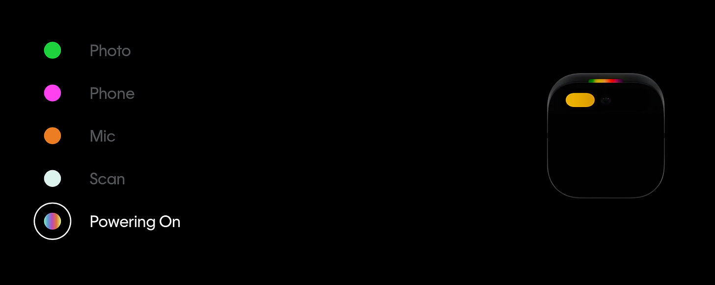
The modalities and the general awareness of the AIPin are vital to achieving ubiquity in UIs.
Considering the Apple user ecosystem of AirPods, Apple Watch, iPhone etc, would a user value the AIPin enough to add it to their environment? The question is, what level of critical mass is required for the introduction of the AIPin?
The Good
Users being able to get a heads-up on messages and other notifications by glancing into the palm of their hand has a lower cognitive load than taking out a phone, or scrolling on a smartwatch.
The no-look touch and gesture pad is also less intrusive.
The cellular connect turns the AIPin into a back-up phone, much like the eSIM enabled Apple Watch. This offers the opportunity to leave your phone behind and travel light only with the AIPin.
Cost will play a significant role, having an eSIM might entice network operators to offer the AIPin as part of a contract bundle, similar to the Apple Watch.
The AIPin as a in-car device can work exceptionally well; while screens demand a high level of cognitive load, the speech UI, with touch, gesture and a very low fidelity projected display makes for an exceptional “low-cognitive load” UX. In some respects the minimalistic low-cognitive load UI reminds of Chris.
German Autolabs presents Chris - the first digital assistant for drivers | German Autolabs Press
No hands on the smartphone while driving! Now you have Chris - the first digital assistant for drivers. The smart…
Some Considerations
Cost and ease of integration into a user’s existing UI and device ecosystem is crucial.
Users prefer voice in a private setting and chat/text in a public setting. In public the AIPin interactions should mostly be silent interactions, with audible interactions in more private settings.
The AIPin can work well if paired with a headset, which provides privacy in terms of device output.
Even-though the AIPin is a “stand-alone device” it is inevitable that users will want to integrate it with existing services and devices.
⭐️ Follow me on LinkedIn for updates on Large Language Models ⭐️
I’m currently the Chief Evangelist @ Kore AI. I explore & write about all things at the intersection of AI & language; ranging from LLMs, Chatbots, Voicebots, Development Frameworks, Data-Centric latent spaces & more.


